Cover Design Q&A: Sea & Shore
9 Jul 2021 |
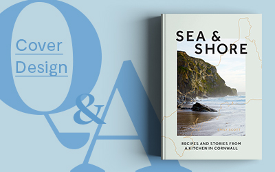
Welcome back to our blog series Cover Design Q&A, where designers and illustrators take us behind-the-scenes on their process of designing covers for our titles. This month we spoke to Nikki Ellis, a freelance book designer and art director who designed the cover for the beautiful Sea & Shore. The cover was chosen by Spine Magazine as one of their favourite book covers for the month! (Follow Nikki on Instagram here or view her portfolio.)
Tell us about yourself.
Hi, I’m Nikki, I have been designing non-fiction lifestyle books for almost 15 years now since graduating from Reading University, with a huge interest and focus on typography. A huge portion of my working life was spent happily at Quadrille Publishing where I learnt the ropes and got to work on some truly exceptional books and with such talented individuals. I made the decision to go freelance in March of 2020 in what can only be described as exceptional timing!
What was the brief?
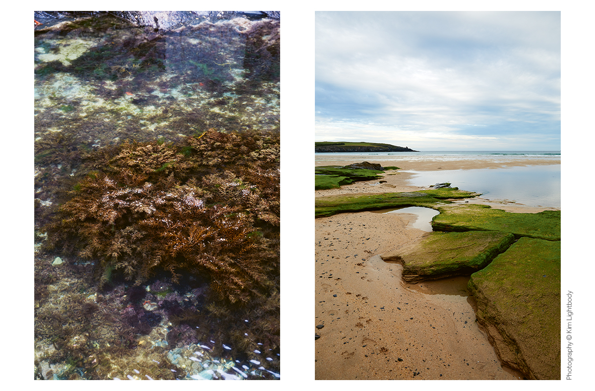
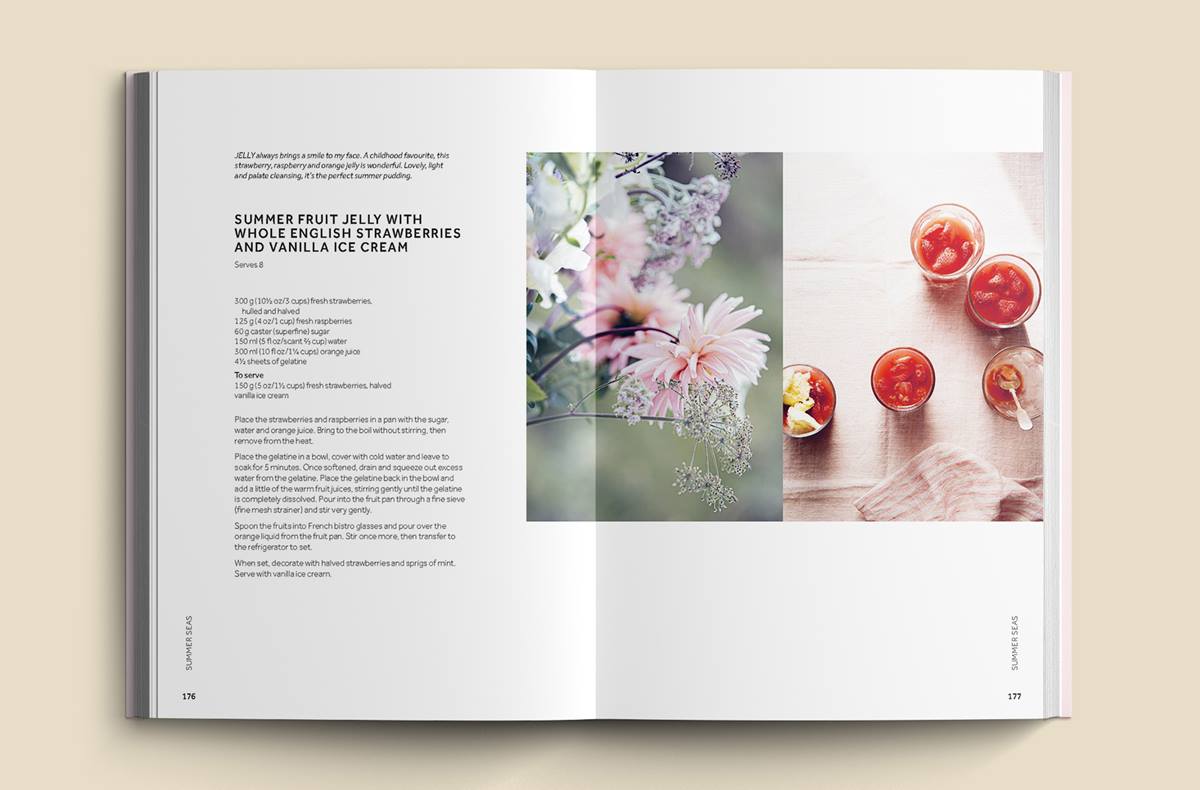
Kajal, editor of the book, approached me to work on this dreamy project last May. She had a great moodboard and vision for the book and saw it having a modern/fresh/elegant vibe and to be viewed as a travel destination book for Cornwall as well as obviously a cookbook. Kim Lightbody was going to be shooting the book and so I knew we would have some really evocative photography. (Below: Photos by Kim in Sea and Shore)
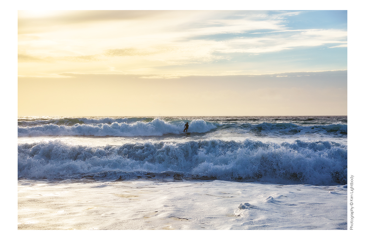
Although the idea of an illustrated cover was briefly discussed, we both felt photography was the way to go. The photo didn’t need to be of food, which is a refreshing change and so our focus immediately went to images of the coast, the crashing waves, the sea. Kajal was keen to have some finishes on the cover (the dream!) and so we discussed a foil being used in someway right from the start.
Can you share with us the process of this project? What was the idea and inspiration for the cover design and layout?
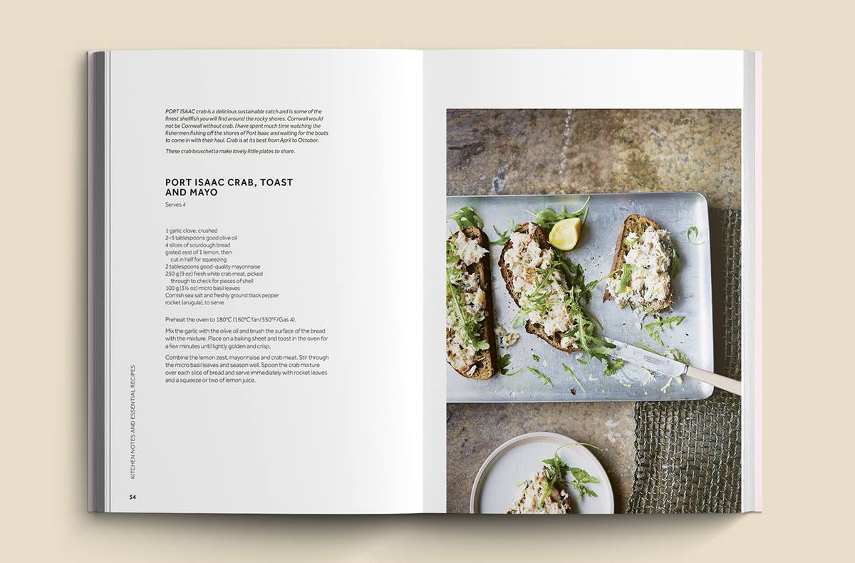
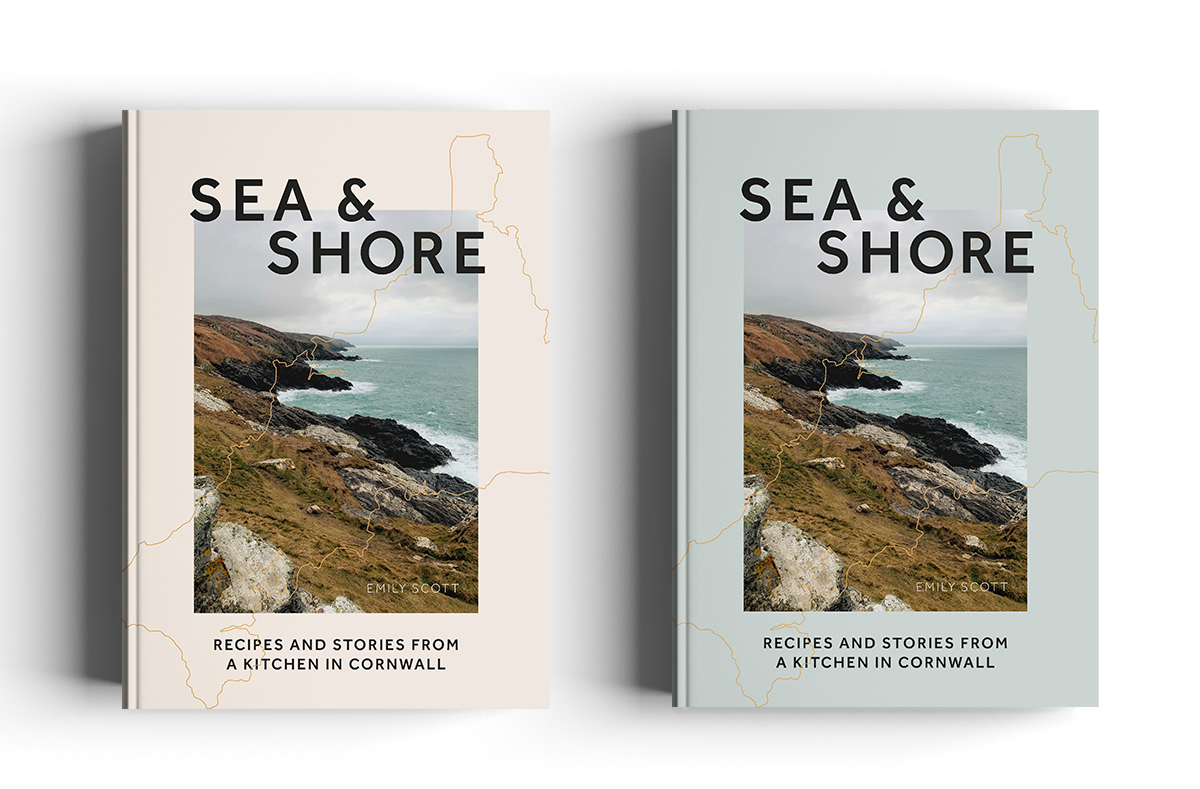
The cover design process needed to start before the photoshoot in Cornwall had happened, in order to meet various sales/catalogue obligations. I contacted Kim and got her to send a selection of images she had already of the Cornwall coastline to use as placeholder images. I worked on the interior designs at the same time and quickly realised that the recipes were fairly short (this never happens!) and I was able to create a grid design which allowed for a lot of glorious white space (a graphic designer’s best friend!).
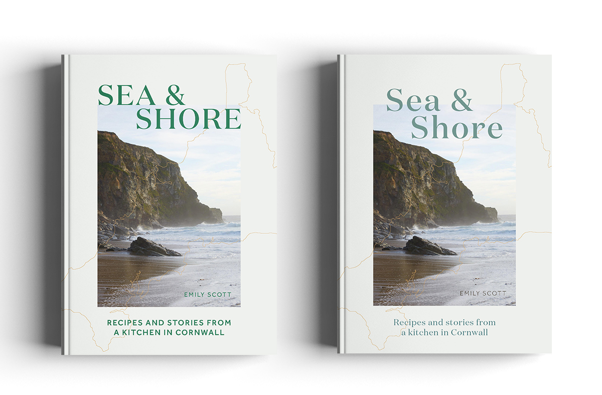
So when it came to the cover, I wanted to create a similar feel - a full bleed picture didn’t feel right so I tried some options with boxed pictures to give that feeling of space reflected on the interior. The eagle eyed among you will see that what ended up as the final cover design was pretty much included in this first round, which almost never happens!
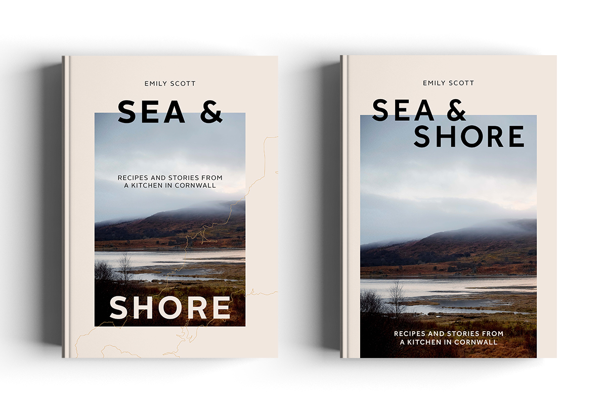
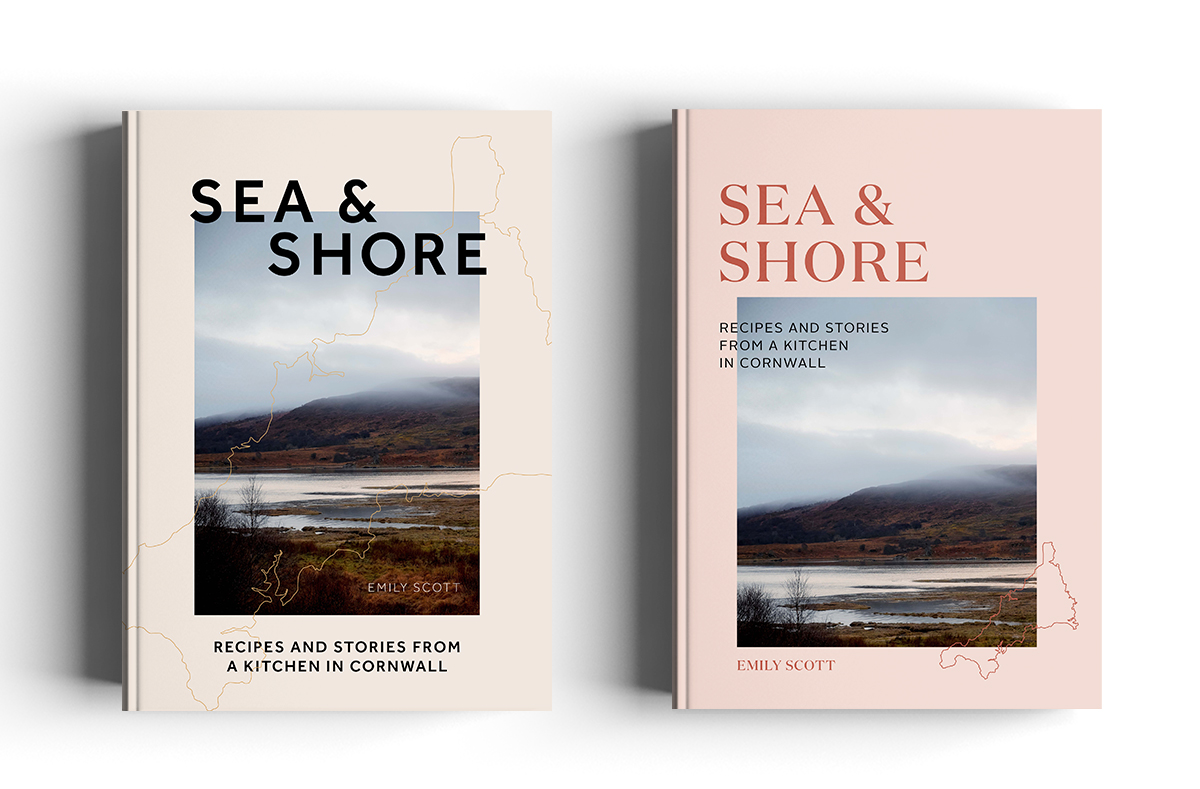
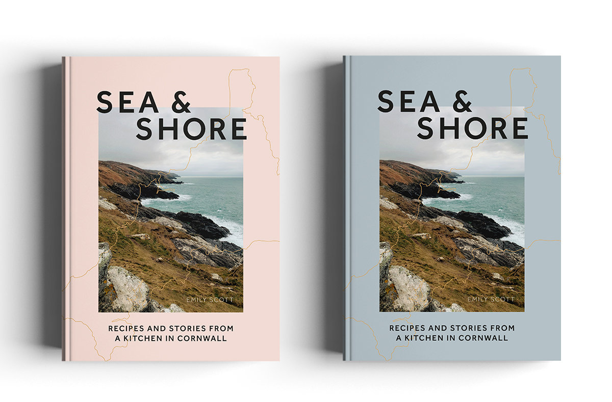
For round 2 Kajal had chosen a favourite approach but wanted the title to sit together in one block and for me to try some alternative colour options (at this point we were still using the placeholder image).
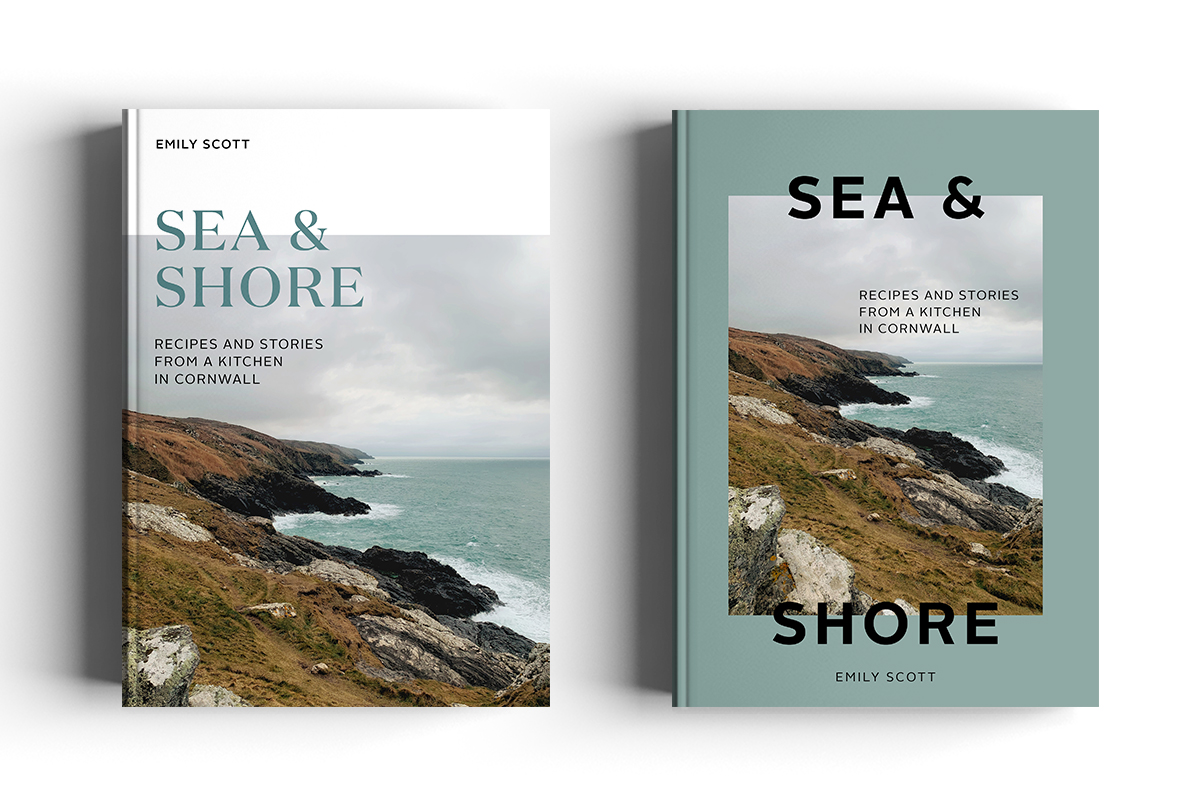
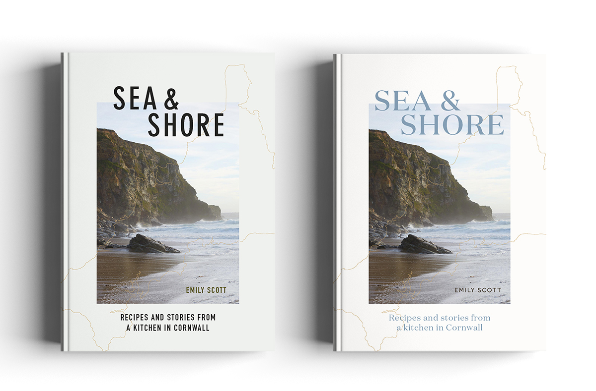
The cover was then put on hold until the photoshoot had happened, I had sent Kim the holding cover so she had an idea of the kind of thing I was after and once she sent me the images from the shoot I popped my favourites in, toning down the background colour on the covers so it didn’t take away from the image.
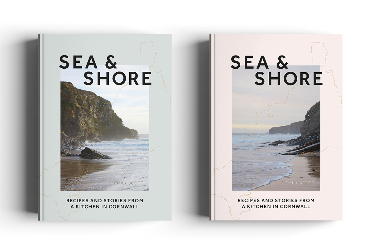
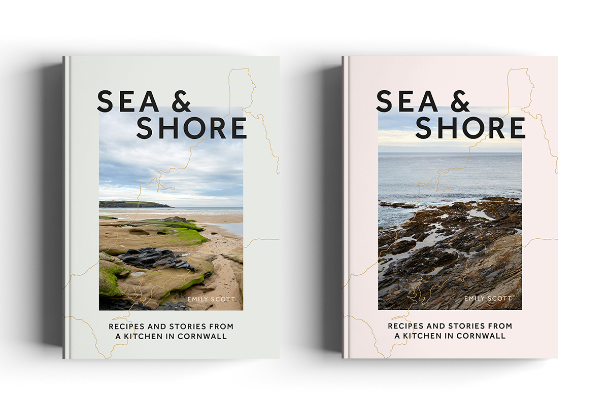
The image was chosen but then the author wanted to see some other font options, at this point I still couldn’t believe what smooth sailing the cover process had been and whilst I was keen on the font currently being used, it was a useful experiment for us all to see how the cover was affected when different fonts were used. Luckily everyone was in agreement upon seeing the options that the original font was best.
I then worked up a back cover design and we had a couple of case tests done with some different finishes on to discuss. I took the foil outline of Cornwall across the spine and onto the back cover, it was something I wasn’t sure I’d be allowed to do from a production perspective, but it came out brilliantly. We also elected to emboss the title and used a black foil for the text. It hopefully all results in a luxury feel and a quality which I was keen to achieve.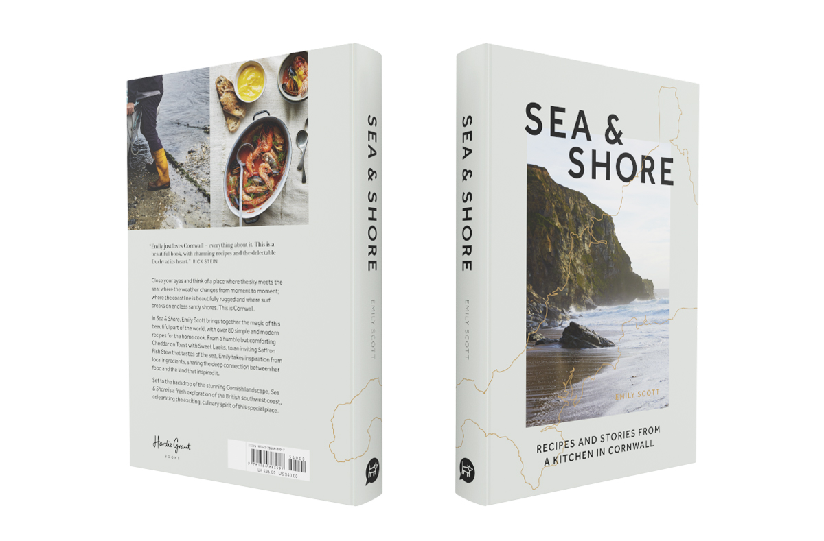
What does a typical work day for you look like?
I love the flexibility that freelance brings, I can fit my hours around my son’s schooling, and work early mornings or evenings as needed, which I often prefer. It took me a while to get the work-life balance right and as book projects are often months long, if you take on too much work as I did at the start of the pandemic you can be paying for that mistake for a long time. But for the most part I try to schedule calls/zoom calls as much as I can so I still get to ‘see’ people especially as since going freelance 3 days before the first lockdown, visiting art directors/authors in offices hasn’t been an option!
What are the challenges you’ve faced as a freelance designer during this pandemic?
I had lots of work lined up before I went freelance but with the pandemic some of those projects were cancelled as publication lists were reshuffled. After a few scary months, things picked up and book publishing seems to be thriving even in these extraordinary circumstances. It’s been a shame not to be able to physically show my portfolio to and meet prospective publishers instead having to rely on emails/zooms. I miss having a design team around me both for the friendships but also being able to bounce ideas off each other, which we used to do a lot when I was in-house.
Do you have any advice for designers interested in going freelance?
Do it! I was so worried as I didn’t have many contacts at other publishers but it’s a small world and I’ve formed some great working relationships in a relatively short space of time. My advice would be to always attach a PDF of relevant work (or fill it with the kind of work you want to be commissioned for) to whoever you are emailing, and then include a link to my social channels, website etc on the email. I have found people are more likely to open an attached PDF than click away to a website link.
Describe Sea & Shore in 3 emojis.
🌊🌿🤍
Where do you find inspiration from?
I follow a LOT of graphic designers on Instagram whose work I greatly admire. I like @spinemagazine on Instagram (find them here) as they do a similar look at how covers came to be. Reading how the briefs are interpreted by different designers, I find hugely inspiring. I find even fiction and children’s publishing can be a source of inspiration. And Pinterest of course.
What is your workspace set up like?
I have a home office and have created a sitting workstation as well as a standing one, which I love. I have the obligatory ‘zoom’ appropriate background complete with bookshelf, but the reality is just out of shot I’m surrounded by discarded tea cups and biscuit crumbs!
Read our previous Cover Design Q&As!
- The Italian Deli with Katherine Keeble
- Crave with Claire Rochford