Cover Design Q&A: Crave
11 Jun 2021 |
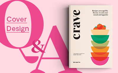
Welcome back to our blog series Cover Design Q&A, where designers and illustrators take us behind-the-scenes on their process of designing covers for our titles. This time we’re looking at one of our recently published titles Crave, designed by Quadrille’s Head of Design, Claire Rochford. (Follow Claire on Instagram here.)
Tell us about yourself.
My name is Claire and I am Head of Design for Quadrille. I have worked for the company for almost 17 years and now manage the amazing in-house design team and our many freelance creatives. I have always loved books and reading so designing them seemed like the natural next step. I dislike Microsoft Word and Comic Sans.
What was the brief?
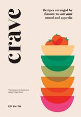
To convey the abstract concept of cravings in illustrated form.
Whom did you have in mind as the consumer/audience?The author Ed has a really great existing audience and a huge number of contacts in the food world. Crave needed to build on the success of his first book but have its own unique identity. And look good on Instagram.
Can you share with us the process of this project? What was the idea and inspiration for the cover design and layout?
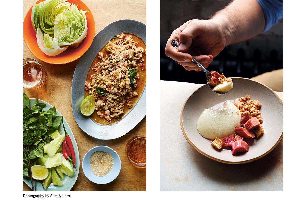
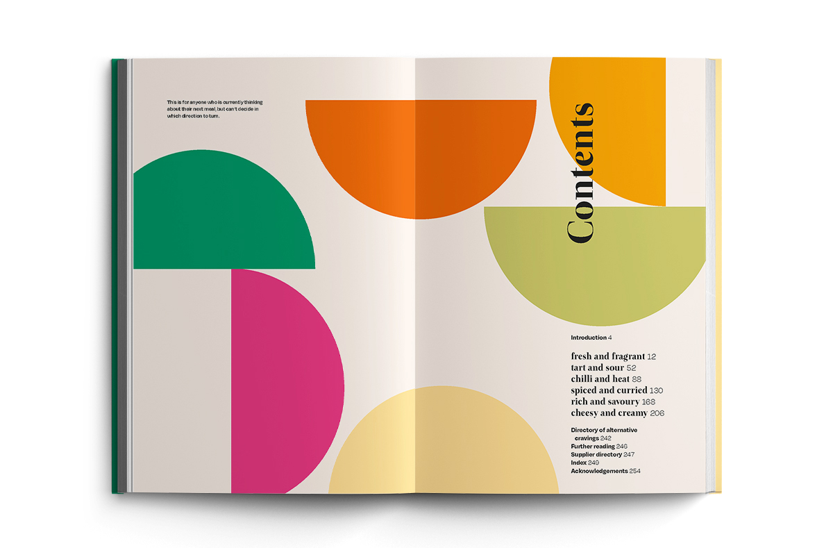
The internal layout almost designed itself. Sam Harris’ photos are really strong, clean and vibrant and I wanted a simple design which echoed that.
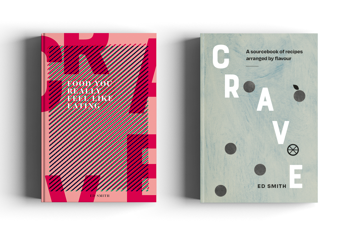
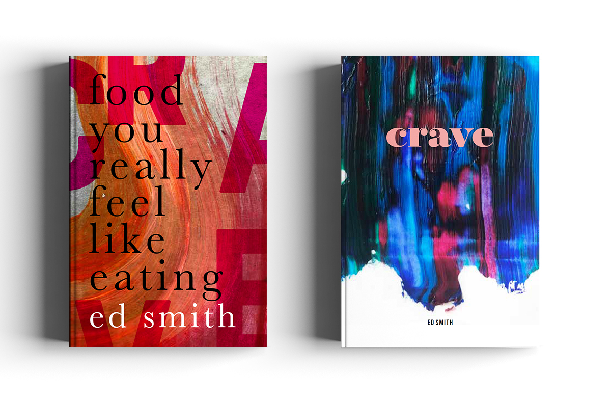
As mentioned above, the creative process for the cover started with the challenge of representing an abstract concept which isn’t the most straightforward thing to do. Ed also had no real fixed ideas on what he felt the cover should be so it seemed like the right project for a bit of a creative brain dump of lots of different concepts.
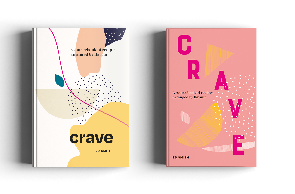
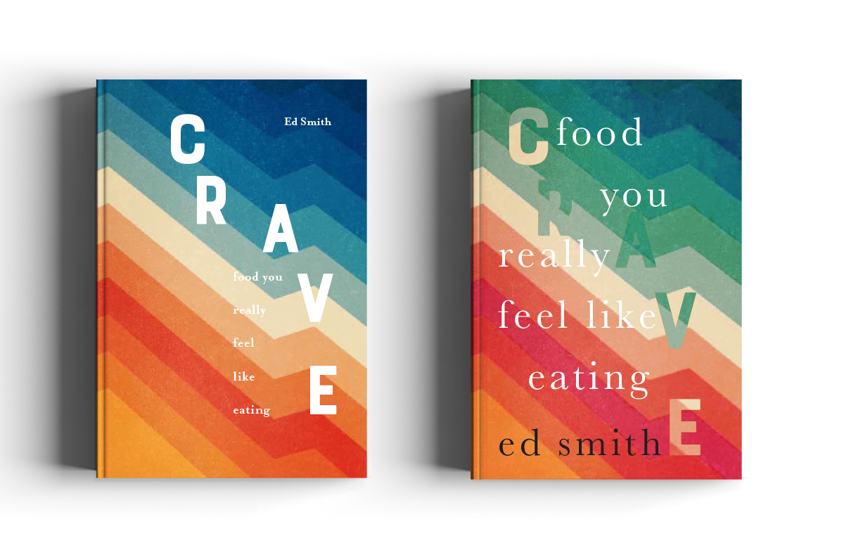
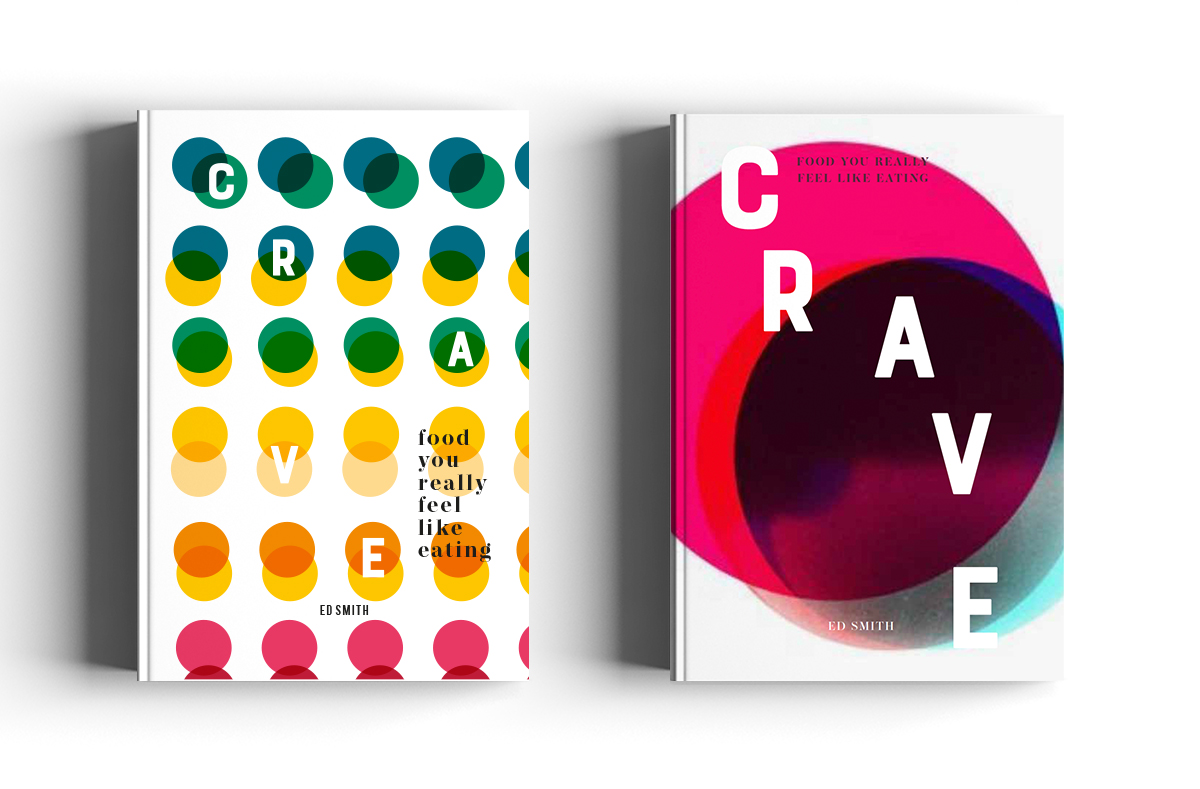
Some were wildly off the mark, others I still miss slightly and one particular design very nearly made the final cut (I used it on the back cover and contents spread though so all was not lost!)
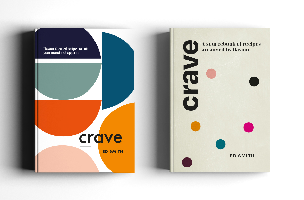
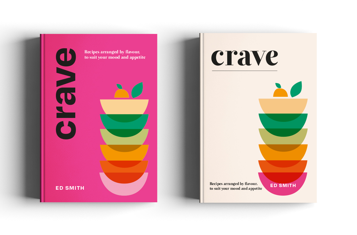
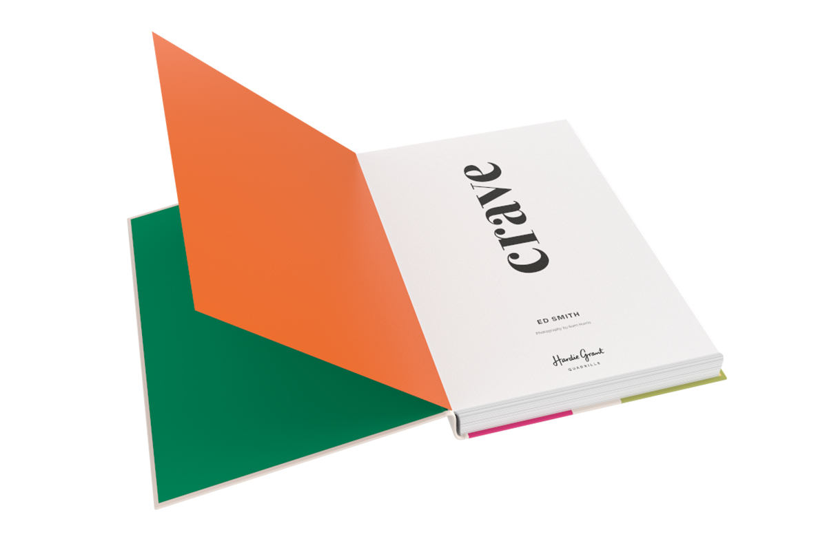
The final flourish of tomatoes in the top bowl was a last minute request from Ed but I think they really complete the cover.
The design itself is so simple I really wanted to add texture: in the form of both graining and emboss. The endpapers are possibly my favourite part to be honest. Nothing wild but I just really love the idea of continuing the colour covers throughout. I do love order and consistency…
What has designing and art-directing this book in lockdown been like for you?
To be honest, lockdown probably helped this particular book! I’m not entirely sure I’d have had the time and space to come up with so many creative options for the cover whilst in the office. At one point I achieved peak productivity, painting up some textures whilst overseeing art class in the garden with my girls.
The obvious downside was not being able to attend the shoot in person. Thankfully the team were amazing and kept in regular contact with us throughout (gutted I missed eating the food though!)
Do you ever experience creative block? If so, how do you work through it?
Less often than I used to…I find it easier to come up with ideas when I have multiple things on the go and as a working mum that’s pretty much me all the time now! If I do struggle I just stop and try something else for a bit.What advice would you give a designer just starting their career?Whatever your day job, keep designing the things you love. It doesn’t matter if it’s not a ‘real’ paid job; that’s the work someone is going to spot in your portfolio and which will spark their interest. Also, make sure your CV is really well designed (it sounds obvious but I’ve seen some shockers!)How do you spend your time when you’re not working?
Outside of work I can usually be found tidying up Lego and loombands for my 4 and 7 year olds, sewing my own clothes and drinking fizzy wine.Where do you find inspiration from?
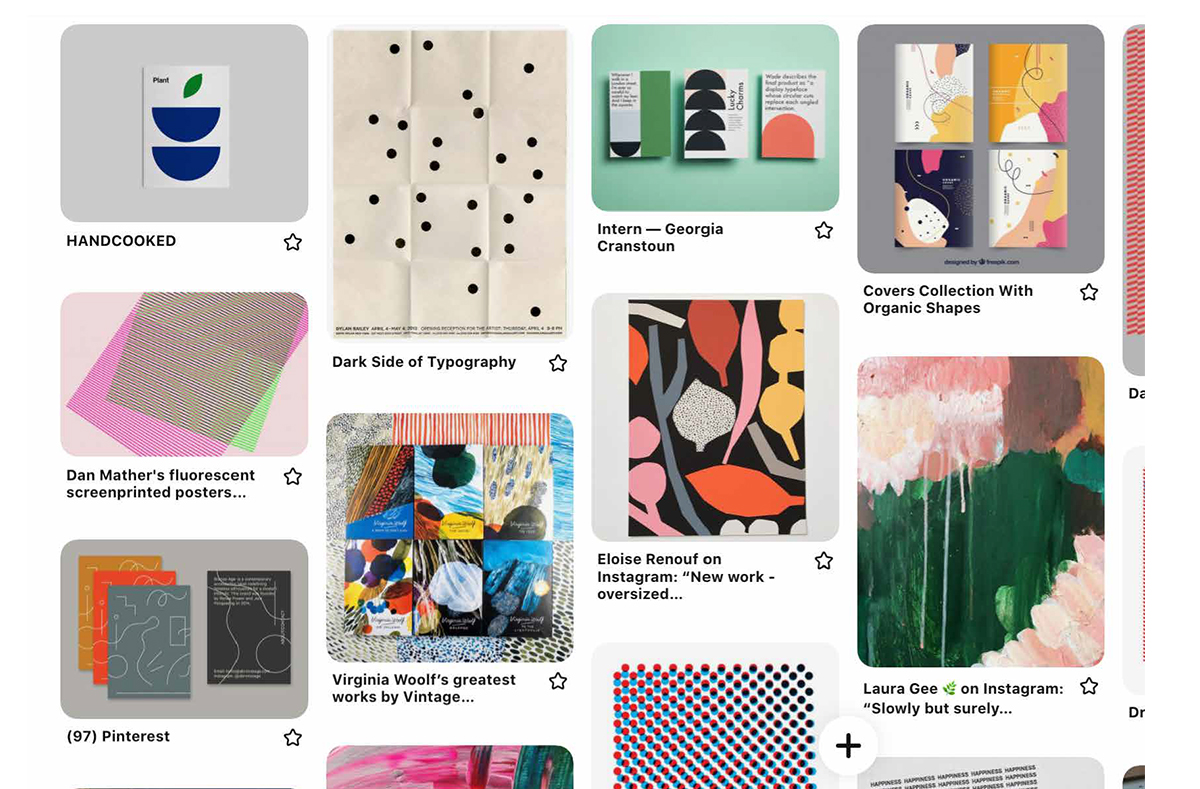
I try my best not to look at other books (especially direct competition) for inspiration and advise taking influences from other areas of design instead. That might be an artist or illustrator, interior design or magazine. There’s a bit of an Eric Carle-vibe to a project I’m working on at the moment.If you were a typeface, what would it be?I mean it’s hard to say anything other than Helvetica isn’t it? Although I like to think I’m a little less functional or old.
 Crave by Ed Smith is out now, available from local bookshops,